How We Make It Happen
Branding
At Palotai Design Co., Ltd., we believe that creating a meaningful brand is like embarking on a grand voyage — a journey not just through design elements, but through culture, identity, and heartfelt collaboration. Our partnership with Andamanda began long before sketches and logos; it started with stepping onto the very soil of Phuket, immersing ourselves in the environment, exploring the market landscape, and most importantly, deeply listening to the owners’ vision—an aspiration to embed the rich spirit of Thai culture in a fresh, modern light.
Brand Guidelines: Protecting the Spirit
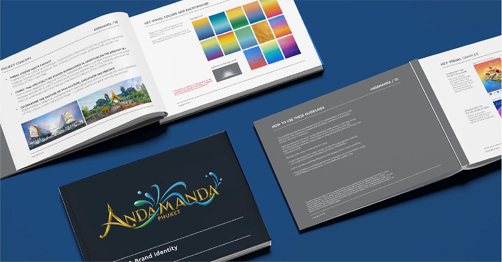
Finally, we prepared a complete brand manual, serving as a guardian for the Andamanda identity. This guide details proper logo usage, typography, colors, and graphic elements so that every application—whether by the client’s marketing team, partners, or vendors—remains faithful to the brand’s core values and aesthetics, preserving the soul we carefully crafted together.

Branding with Andamanda: Crafting a Journey Beyond Design
In-Depth Exploration and Close Collaboration, we thoroughly analyzed the space by reviewing project layouts and exterior concept visuals. From this foundation, we studied the market and identified the target audience—international tourists seeking experiences that are Fun, Spectacular, and distinctively Thai through a world-class water park.
"Design that captures
the spirit of Fun,
the thrill of Spectacular,
and the soul of Thai culture."
The core design brief from our client was clear: the brand must strongly embody the identity of a water park, conveying excitement, fun, and the essence of Thai culture. This brief guided every aspect of our creative development—from logo design and color palette to graphic elements—to ensure the brand stands out and resonates deeply with its audience.
Concept and Visual Language: “Where Legend Meets Fantasy”
Our creative concept draws inspiration from Thai legends and folklore, weaving them into an adventurous fantasy that lies at the heart of the Andaman Sea. The brand narrative invites visitors aboard a “ship of leisure,” a magical vessel navigating a lost kingdom of water—imbued with mystery, excitement, and cultural richness.
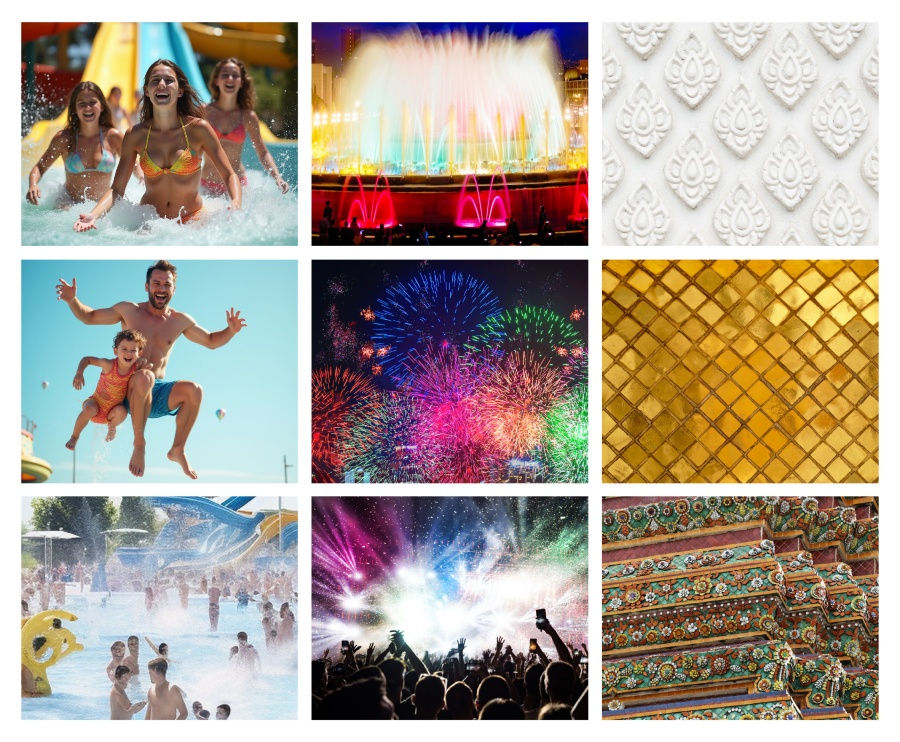
The visual language fuses evocative symbols—from fluid water waves and splashes to traditional Thai motifs like delicate floral patterns, stylized mythical creatures, and intricate architectural flourishes. These elements (as beautifully showcased in the traditional blue and gold iconography) conjure a sense of dynamic movement and cultural heritage, symbolized by playful waves and ornate details seen in the brand’s icons and patterns.
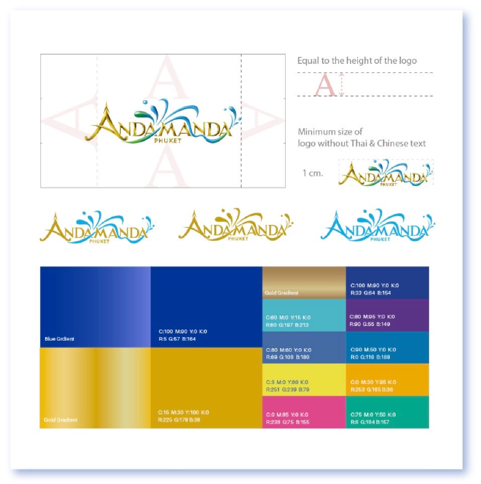
Logo Design and Color Palette: Fluidity Meets Tradition
The Andamanda logo reflects this meeting point of culture and playfulness. Inspired by the gateway’s traditional Thai roofline architecture, the logo captures a flowing wave, symbolizing splashing water and the exhilarating fun of the waterpark. It masterfully balances classical elegance with vibrant energy—the gold gradients representing richness and tradition, while the blue gradients evoke the refreshing and lively waters of Phuket.
The thoughtfully curated color palette extends the story. Deep blues invite calm and trust, golds communicate warmth and premium quality, and brighter complementary colors add flair and excitement—perfectly speaking to the international traveler while honoring Thai roots.


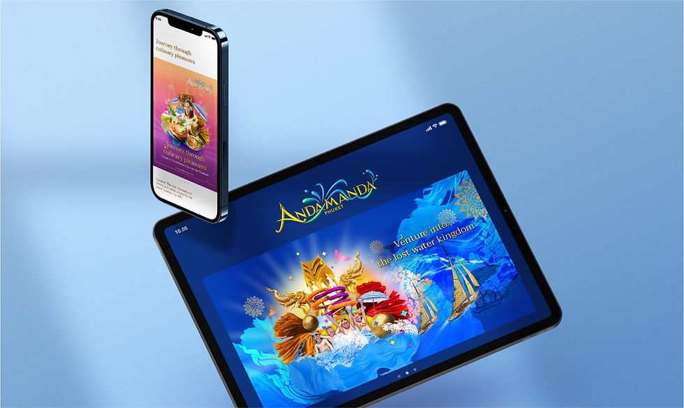
Our design extends beyond the logo into a comprehensive visual system that is both adaptable and impactful. Fonts, poster layouts, promotional imagery, and digital assets all adhere to this cohesive style—ensuring every touchpoint, from print to mobile screens, communicates a seamless Andamanda experience.
Visuals bring to life joyous moments—families laughing aboard water rafts; dazzling fireworks illuminating the sky; dynamic shots of aquatic fun—all captured in vibrant, colorful imagery that resonates with the brand’s promise of spectacular fun and authentic Thai culture.